Every day Google is asked billions of questions: the best places to eat, the latest marketing techniques, the best new blog and consumers areusing smartphones to do it. These days more Google searches take place on mobile devices than on computers
This was all announced last year and means that now more than ever before having a well thought out mobile site is essential, the mobile-first bot is on its way to crawling the entire web–because of this your content will soon be ranked primarily on the content it serves to mobile user-agents.
We’ve collected the most common myths heard around Google’s move to a mobile-first index and myth busted each one.
MythNo. 1 –I haven’t optimised for a mobile site, I’ll be penalised in desktop rankings!
Busted.Google have said that they’ll use a desktop site’s SEO to calculate rankings in absence of a mobile version:this is great, but you won’t get the ranking boost in mobile if you don’t have it. You won’t rank as well as your business rivals in mobile search who do have a mobile site or responsive design.
If mobile traffic is important to you, which it should be considering some searches have a 50-60% share(or more) from smartphones, then it’stime to get something in place to stay ahead of the curve.
Myth No.2 – My customers don’t buy via mobile, so I don’t need to worry about mobile rankings…
Busted.For many purchases, mobile sites play an important part of the research phase of the buying process, with potential customers often returning to your site several times before hitting the ‘buy it’ button. After careful consideration, you should tailor your mobile experience to the type of visitor who’s most likely to progress in the sales funnel, even if that spans multiple sessions and a number of devices.
According to data from Criteo – 50% of all ecommerce purchasing now involved touchpoints across multiple devices.
Myth No.3 – Mobile site speed will be all that’s important, so I don’t need to worry about streamlining my desktop site.
Busted.Yes, the SEO world recognises site speed as a ranking factor, but both mobile and desktop site speed remain important for the end user, and therefore Google. So don’t neglect site speed for either version.
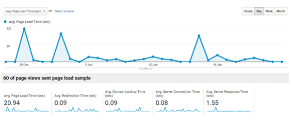
Test your site speed using Google’s PageSpeed Insights and the new Mobile-Friendly test, but you can record actual session data in Analytics.

Myth No.4 – I’m going to have to change all my canonical URLs from desktop to mobile
Busted. The canonical element will be read by Google’s mobile-first bot and the effect of the tag will be applied only to the desktop index. Don’t change anything, but do make sure that you have the right alternate tags on each version of your site.
Myth No.5 – I’ll have to rethink my link building strategy
Busted. Google have confirmed that there are no plans to change the way links affect rankings (for now). This means you won’t have to specifically target ’mobile only’ links, and links from non-mobile friendly websites shouldn’t have any less impact.
A key change you can implement though is to start to link build for keywords that your audience use to search on mobile. You can use Search Console in Webmaster Tools to filter by mobile devices to discover your mobile keywords.

Myth No.6 – I’m going to need to add new schema and hreflang, It’s so time consuming.
Busted. – Adding any new schema will be unnecessary, but you should make certain that you have your mobile site marked (in exactly the same way your desktop site is). This means you need to include product, and local schema, plus any internationalisation that you’ve applied to your desktop site. Of course this is easiest when you’re running a single site, with a responsive design, but will require a little work when you’re running a mobile version alongside your desktop.
Myth No.7 – I’ll need to rewrite all mymeta data, that’s something I don’t want to have to do.
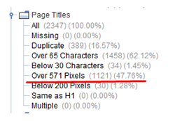
Busted. If you have a single site with a responsive design (desktop and mobile) then you’ll need to make sure that your titles and descriptions are short enough to hitthe character or pixel limits set by Google. The mobile index gives you a few more characters to play with, which thankfully means if your titles are within the desktop limit (65 – 70 Word character or 570 pixels) then they won’t need to be adjusted at all.
If you want to check you can either live crawl your site, or upload a CSV containing your meta data to Screaming Frog. The side panel will filter your data by pixel or character count above the limit.

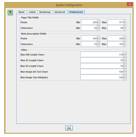
As an added extra – you’ll find that you can set your own limits in the Spider Configuration window:

James Newhouse is the Head of Natural Search at Receptional.


